
Understanding CSS Animation: The Difference Between Transition and Animation Keyframes and When to Use Them
Introduction
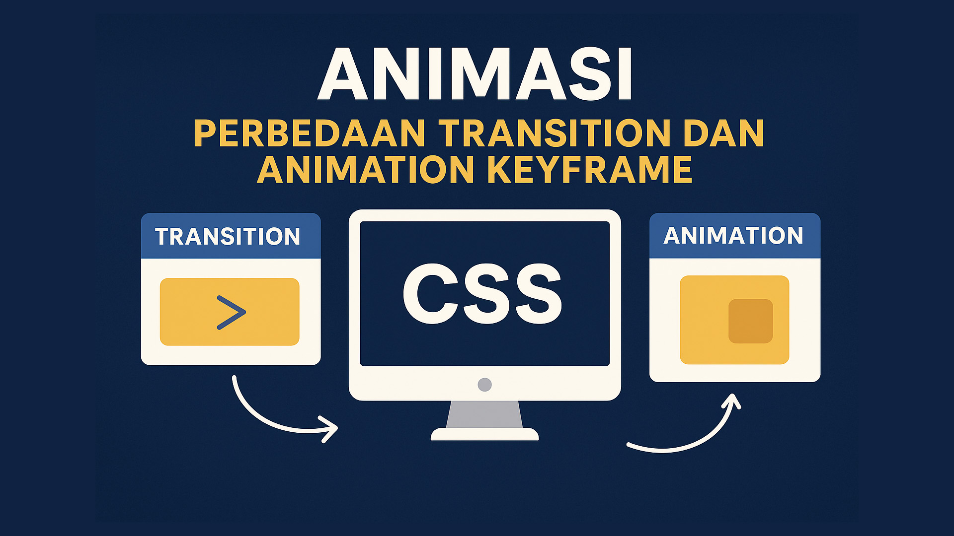
In modern web development, animation plays a key role in enhancing user experience. CSS provides two main methods to create animations — transition and animation (keyframes). Both make visual changes smoother, but their mechanisms and use cases differ significantly. This article explains their differences and the right situations to use each.
What is a CSS Transition?
A transition allows a smooth change between two CSS states. It’s often triggered by user actions like hovering or focusing.
Example:
button {
  background-color: blue;
  transition: background-color 0.5s;
}

button:hover {
  background-color: red;
}
Here, the button’s background color changes smoothly within half a second.
Transitions are ideal for:
-
Hover or focus effects.
-
Color, size, or opacity changes.
-
Small, user-triggered animations.
What is a CSS Animation (Keyframes)?
Unlike transitions, animations with @keyframes can define multiple stages of change. This enables more complex and sequential effects.
Example:
@keyframes fadeIn {
  0% { opacity: 0; }
  100% { opacity: 1; }
}

.box {
  animation: fadeIn 2s ease-in-out;
}
This example makes the element fade in from transparent to visible within two seconds.
Animations are suitable for:
-
Repeating effects (looping).
-
Complex movements or transformations.
-
Automatic, non-user-triggered animations.
Key Differences
| Aspect | Transition | Animation (Keyframes) |
|---|---|---|
| Trigger | Requires user interaction | Can run automatically |
| Stages | Only start and end | Multiple stages (0%, 50%, 100%, etc.) |
| Complexity | Simple | Complex and flexible |
| Looping | Not supported | Possible with animation-iteration-count |
| Duration Control | Via transition-duration |
Via animation-duration, delay, timing-function |